Use cases
Designers — targeted iteration, multi-surface collaboration
Traditional flows force designers to slice, re-export, update annotations, sync with engineers, and verify the final pixels. Design pulls iteration back into the canvas: lasso a region, mark intent, and the agent adjusts based on canvas context. Use Nudge to fine-tune color and spacing in real time. The output keeps a readable, hand-offable engineering structure.Product managers — high-fidelity prototypes, ready when you are
Hi-fi prototypes communicate design direction clearly but typically depend on the design team’s bandwidth. With Design, structured Questions align intent, the Design Plan confirms direction, and the canvas produces a clickable, design-grade prototype you can take straight into a review or stakeholder demo.Marketing & operations — many directions in parallel
A single campaign needs key visuals, banners, and landing pages, but design bandwidth often forces a single direction. With Design, you describe theme and tone, confirm via the Design Plan, and switch entries under Auto Style Reference to generate parallel directions covering posters, banners, and landing pages.How it works
Design reshapes how AI produces design through three mechanisms:- Questions — when input isn’t enough, the agent asks structured questions to align intent first instead of guessing. Less wasted iteration.
- Design Plan — before generation, the agent produces a structured plan (layout, style, content hierarchy) under the Plan tab. You confirm, then it executes.
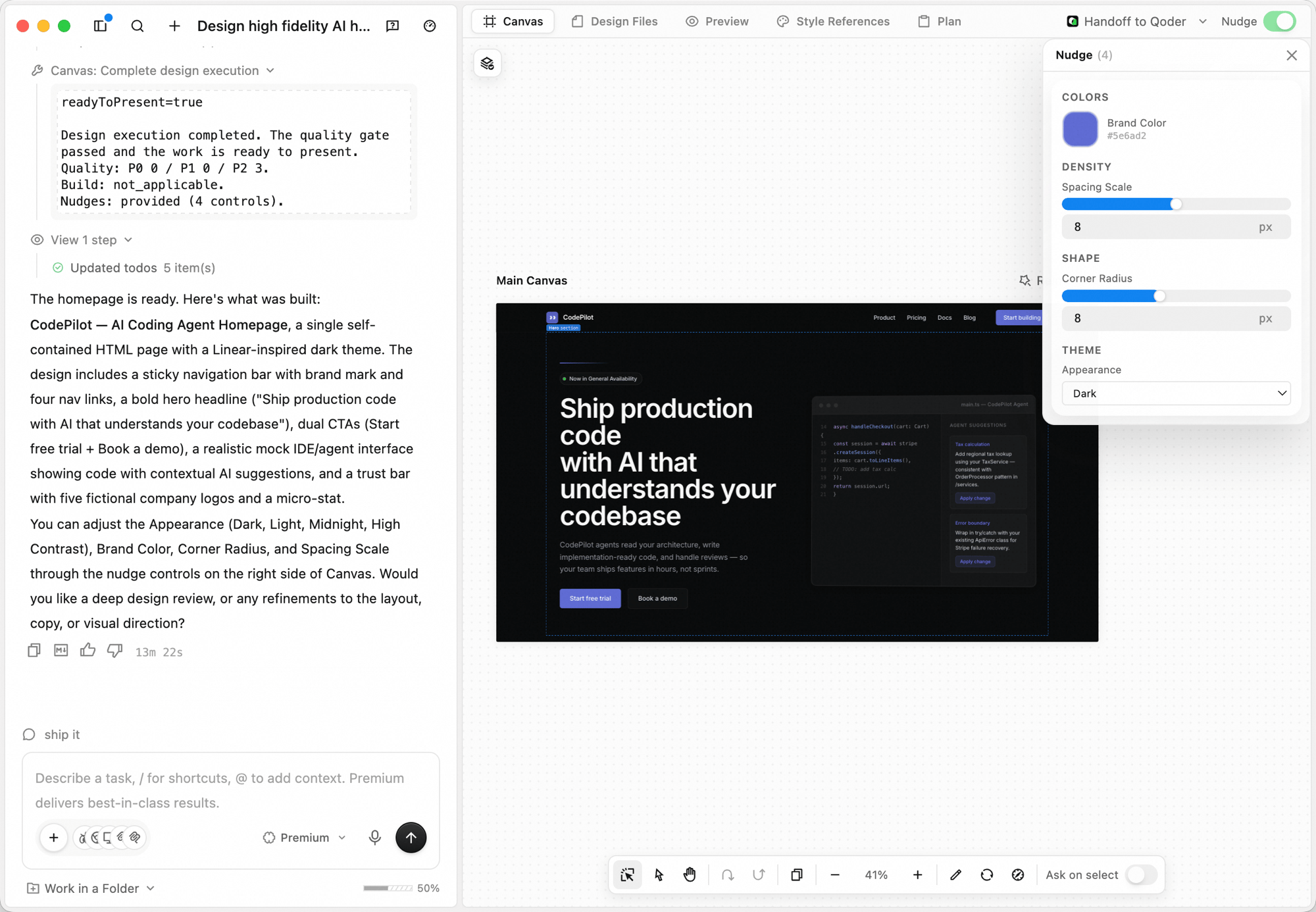
- Nudge — after generation, key decisions like color, spacing, and corner radius are exposed as adjustable parameters. Fine-tune them without re-describing the brief.
Workspace
| Tab | What it does |
|---|---|
| Canvas | The infinite design surface where the agent generates and edits |
| Design Files | The underlying engineering files behind what’s on the canvas |
| Preview | Preview the running design as a real interface |
| Style References | View and switch the active style reference used by the design |
| Plan | The structured Design Plan the agent uses before generating |
Creating a design
Switch to Design
In the input box at the bottom of the QoderWork home, click the workspace switcher (defaults to General) and choose Design.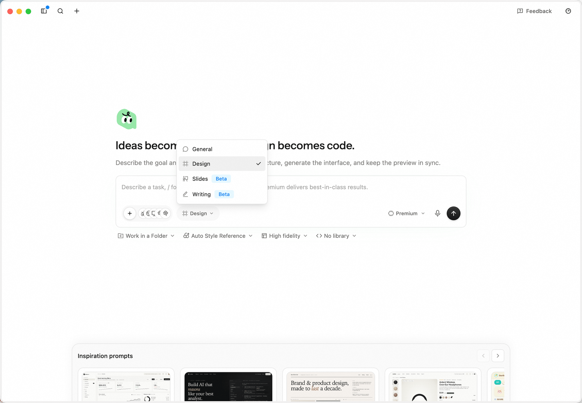
Describe what you want
Type or dictate the brief. Be concrete about purpose, key sections, and tone — for example: “Design a high-fidelity AI product homepage with brand navigation, a strong headline, product value proposition, primary CTA, secondary CTA, product UI preview, and customer trust proof. Make it modern, credible, and refined.”Paste screenshots and links directly into the input. Click the microphone icon for voice input.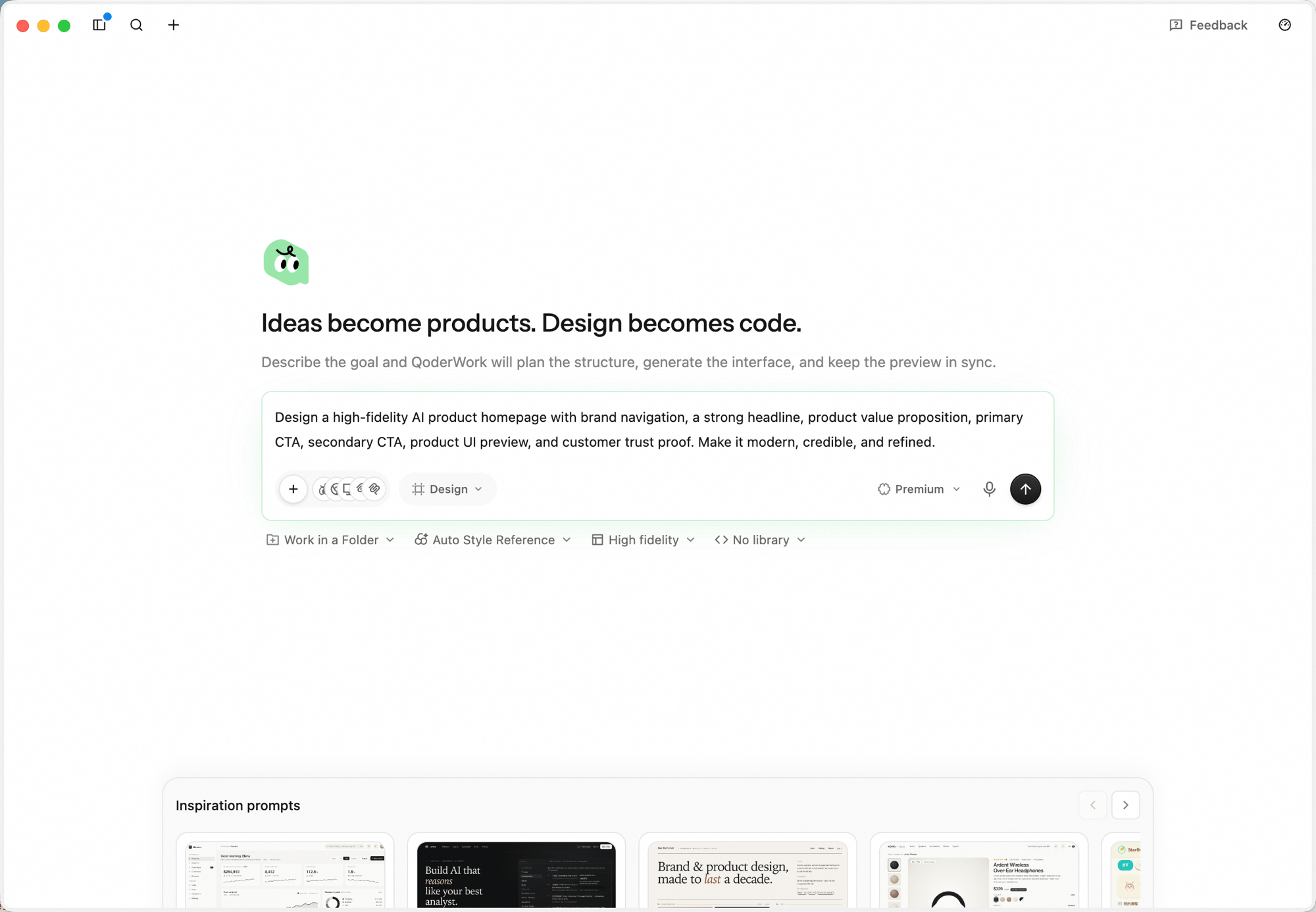
Pick a style reference, pin a folder (optional)
A toolbar under the input box exposes the workspace’s optional setup: Work in a Folder, Auto Style Reference, Fidelity, and Component library.
- Click Auto Style Reference to lock the overall look-and-feel before generation — keep Auto Style Reference to let Canvas pick the best fit from 161 references, or pick a specific style like Airbnb, Airtable, Apple, Carbon, or Cloudscape. Use the search box at the top to filter by name.
- Click Work in a Folder to pin the task to a local directory — the agent writes engineering files into that folder, which keeps the project maintainable over time and ready for handoff to Qoder IDE.
- Click Fidelity to switch between Wireframe (low-fidelity layout, minimal visual styling) and High fidelity (production-grade visual design and detail, the default).
- Click Component library to pick a target — defaults to No library (HTML-first unless the brief explicitly calls for React or another framework). You can also pick from shadcn/ui, Spark Design, or Ant Design — the agent will generate against the chosen React library.
Run directly, or enter design planning
After you submit, the agent first reads the brief and does a quick analysis pass (the reasoning shows up in the left panel as Thinking entries), then surfaces an Enter design planning decision card with two buttons: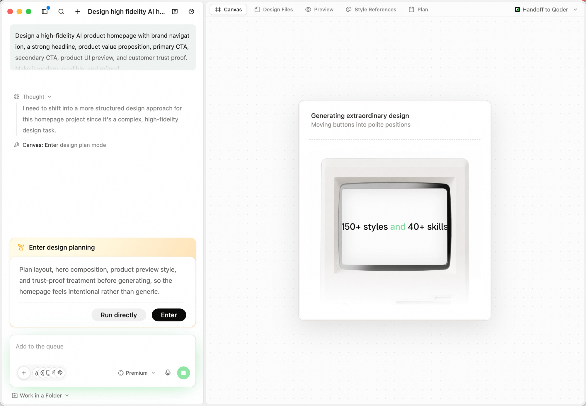
- Run directly — skip the structured questions and the design plan; the agent generates straight onto the canvas using whatever context it already has. Use this when the brief is small or you just want a quick exploration.
- Enter — turn on design planning. The agent will first ask clarifying questions, then produce a Design Plan, then generate. Recommended for high-fidelity or production-grade work.
Answer the agent's clarifying questions
In design planning mode, the agent opens a Questions tab and asks a few structured questions — product type, audience, fidelity, brand assets — each rendered as single-select options with an Other free-text fallback. Answer them so the plan matches your real context; click Let AI decide at the bottom if you’d rather skip the back-and-forth.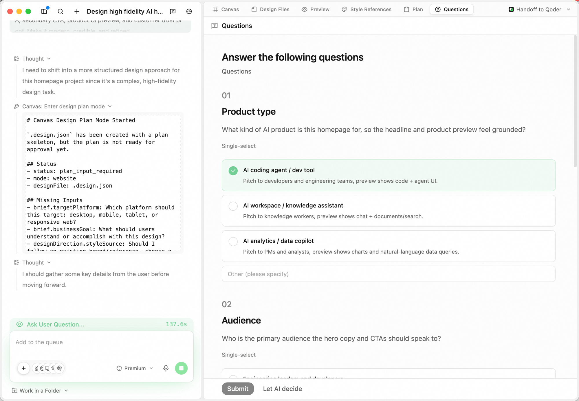
Confirm the Design Plan
The agent then writes a Design Plan under the Plan tab: a summary of intent and direction, a Contract panel (artifact, platform, output, library, fidelity, style), and the list of Artifacts with a one-line goal each. Hit Run plan to ship it, or Request changes to push back before any pixels are drawn.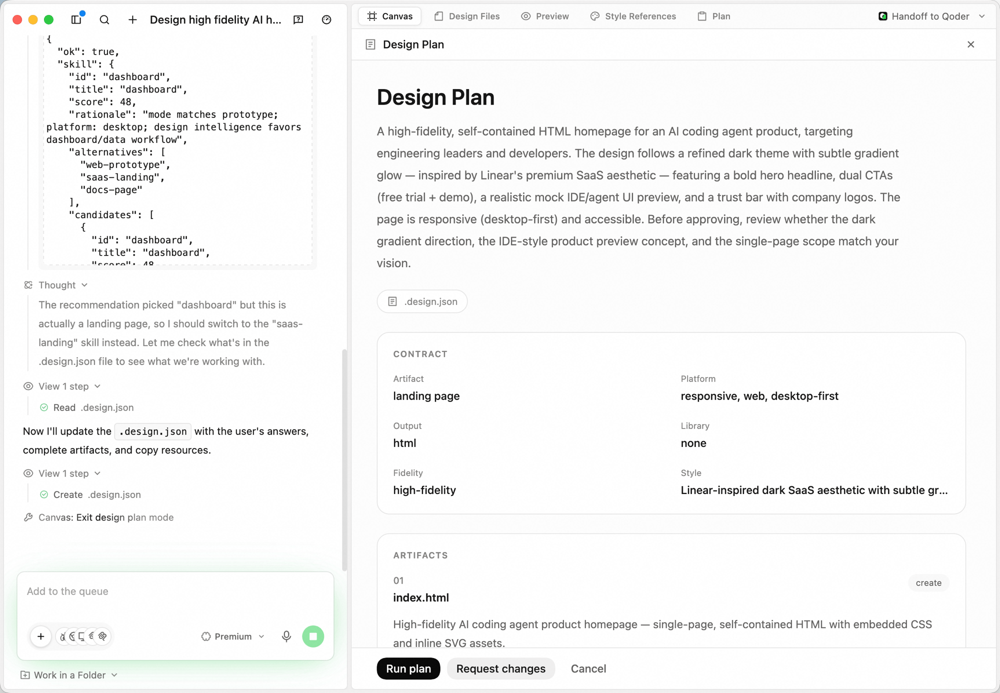
Watch the canvas fill in
The agent generates on the Canvas tab. Reasoning appears in the left panel as Thinking entries; the canvas updates in place as each component lands.
Iterating
You don’t need to redo a brief from scratch — keep iterating in place.- Add to the queue. Send follow-up instructions in the bottom input box — they’re picked up after the current step.
- Stop a run. Click the stop button next to the input while the agent is generating to halt mid-flight.
- Lasso and annotate on the Canvas. Select a region and tell the agent what to change there; it adjusts based on canvas context instead of regenerating the whole frame.
- Nudge key parameters. After generation, the agent exposes color, spacing, and corner-radius as adjustable values — tune them without re-describing the brief.
- Switch models mid-run. Use the model dropdown next to the input (e.g. Standard / Premium) to change models for the next step.
- Edit the engineering files directly. Open Design Files to inspect or edit the source files when you need to drop into code.
Typical Scenarios
Product landing page
Marketing visual kit
Dashboard redesign
Handing off to Qoder
Click Handoff to Qoder in the top-right corner to send the current code artifact straight to Qoder IDE for downstream work. A designer comfortable with frontend code can pull the same branch, continue iterating, and submit code without ever leaving the design surface.Next Steps
Slides
Create presentations with AI Slides
Writing
AI-assisted writing and polishing